The Project
Adorned Home & Lifestyle is a beautifully curated retail boutique right in the heart of Gananoque. This project was a major assignment for my marketing program where we were grouped into mock agencies.
Our group formed DARE, a reflection of our bold approach to marketing, and an acronym representing our team and roles: Dona (Project Manager), Ahmed (Creative Director), Ryan (Copywriter), and Ezel (Events and Activations Coordinator). I even designed a custom logo to represent our newly formed agency. Our collective goal was to build a comprehensive marketing plan to help the boutique target the heavy summer tourist crowd visiting the 1000 Islands. While the research and strategy were highly collaborative, my core role as Creative Director was to handle the visual design and bring our campaign to life.
Print Design: Balancing Information and Aesthetics
To drive foot traffic, we knew we had to catch people where they already were. I designed physical, postcard style ads meant to be placed at the Gananoque Visitors Centre and other surrounding local businesses. To keep the marketing fresh year round, I developed the postcards using different colours and visual themes to match the changing seasons.
One of the biggest hurdles with the print ads was the sheer amount of information the client needed us to include. I had to find a way to fit store hours, the address, contact info, and multiple different brand collections, like Pink Martini, Bathorium, and Midnight Paloma, onto a small postcard without making it look like a cluttered mess. I focused on clean typography, breathing room, and high-quality lifestyle imagery to keep the design welcoming and readable.
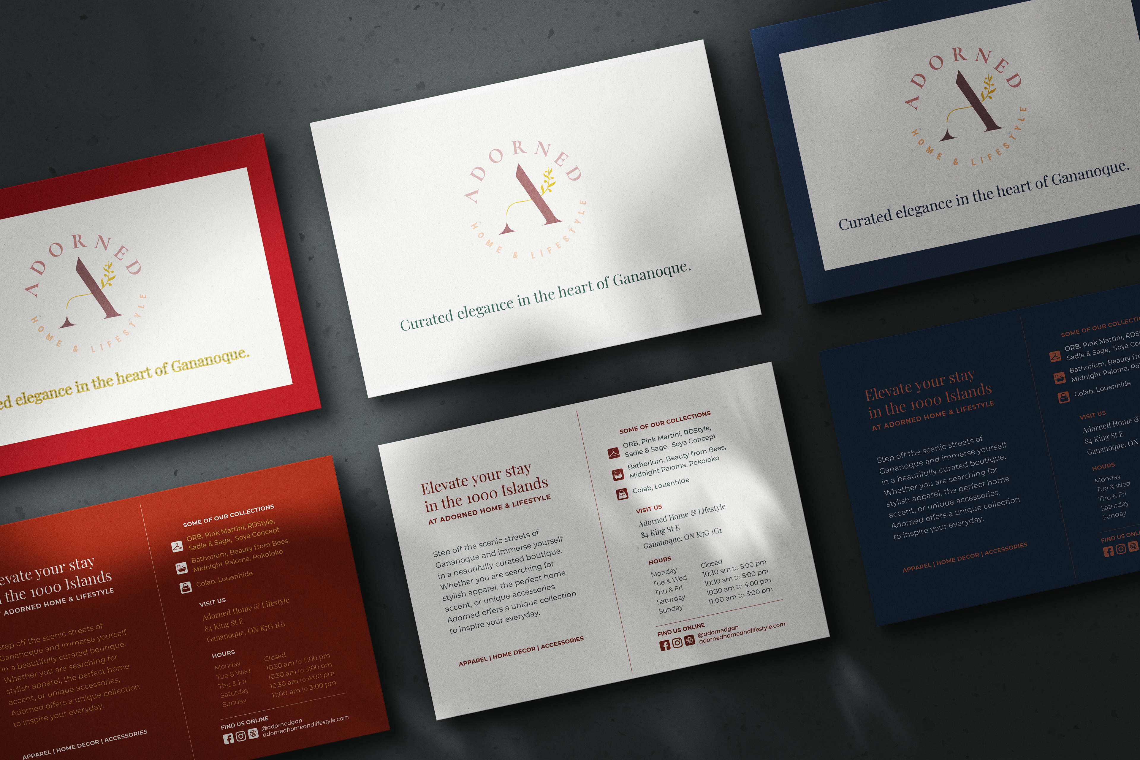
Physical postcard advertisements featuring seasonal colour palettes, designed for placement at local visitor centres.
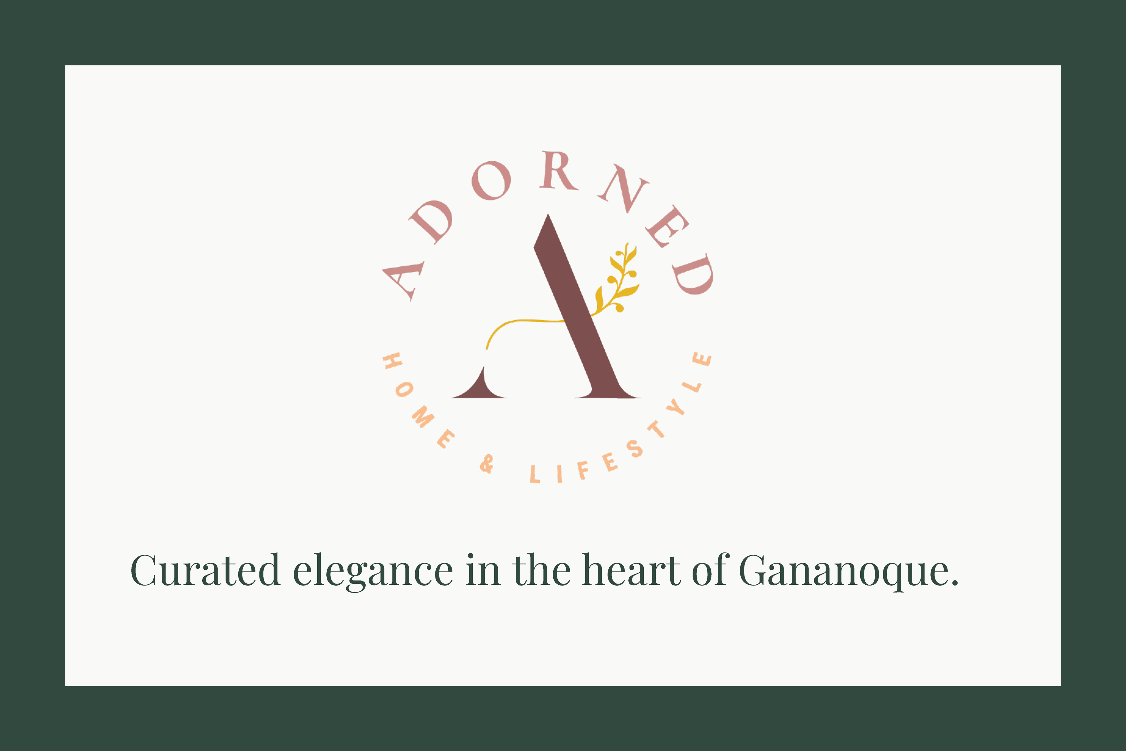
The flat front design of the green Spring themed postcard, showcasing the established brand typography and welcoming tone of voice.
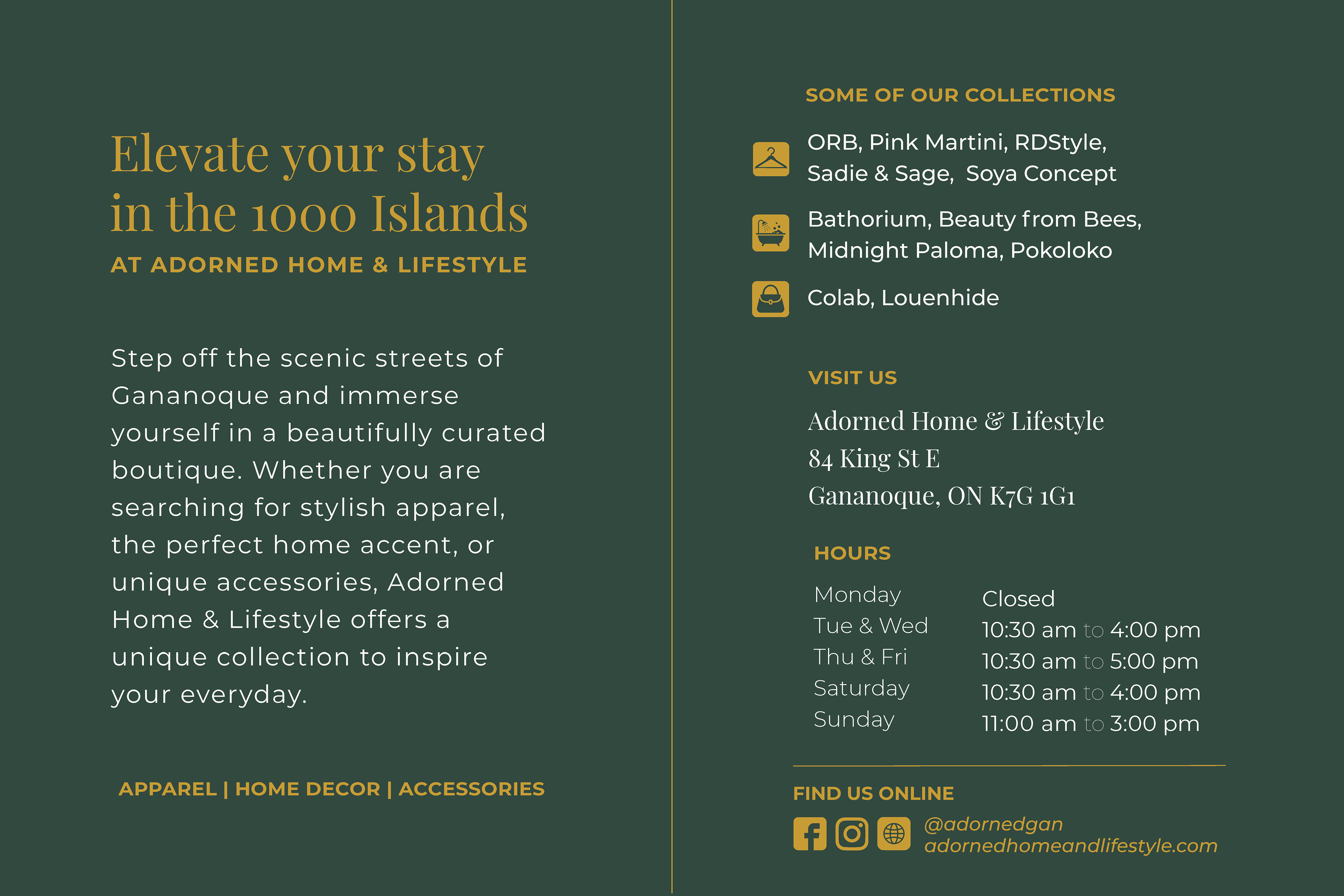
The flat back design of the green Spring themed postcard, showcasing the established brand typography and welcoming tone of voice.
Establishing the Brand Voice & Typography
A major part of this process was defining the boutique's tone of voice and locking down a specific set of paired fonts that reflected their curated, elegant vibe. I made sure we kept this typography strictly consistent across all of our branding materials. Regardless of if a customer was reading a physical postcard or scrolling through the website, the brand felt unified and recognizable.
A Complete Digital Toolkit
The physical marketing materials tied directly into a digital overhaul. I completely redesigned their existing website using Wix, applying our paired fonts and defined tone of voice to bring the high-quality brand identity online.
The website can be viewed here: adornedhomeandlifestyle.com
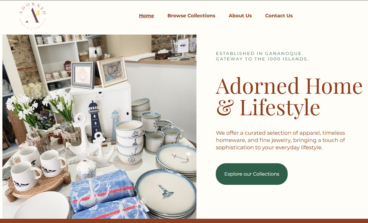
The redesigned Wix website Home page, designed to capture attention and tuned to the target audience.
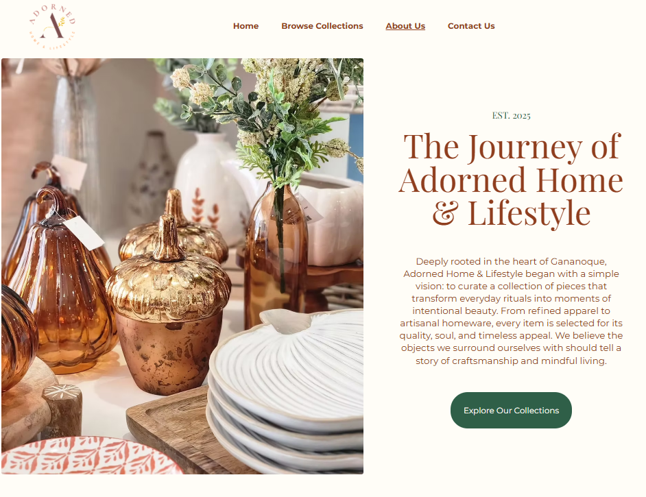
The redesigned Wix website About page, designed to answer audience questions and create interest.
Beyond the website, we wanted to make sure the client had everything they needed to succeed. Our team collaborated to create examples of branded social media posts. We also produced a promotional tour video to show off the inside of the boutique. Together, these elements provided the client with a cohesive, ready to use digital toolkit.
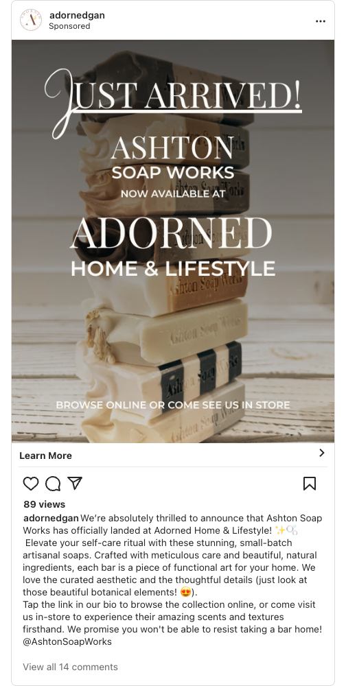
Adorned Home & Lifestyle "JUST ARRIVED" Mockup
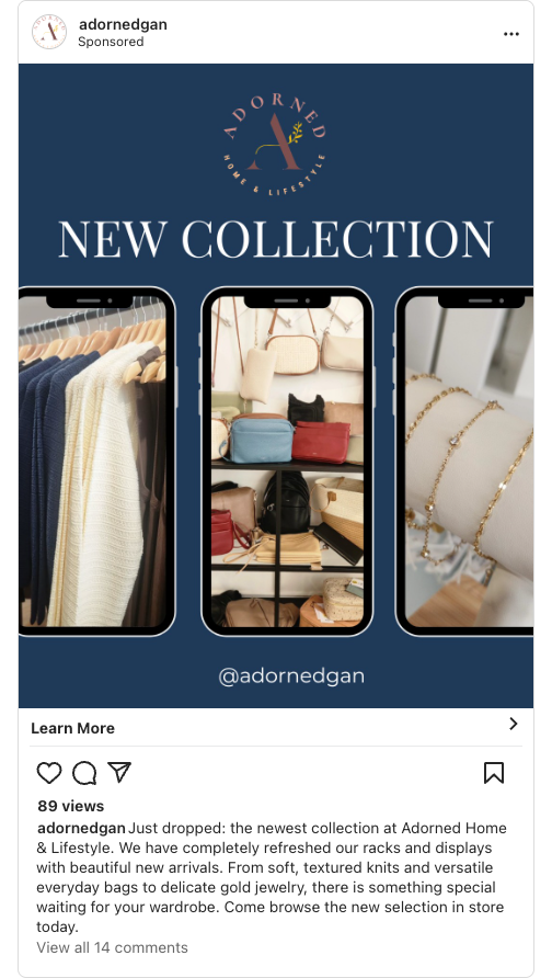
Adorned Home & Lifestyle "NEW COLLECTION" Mockup
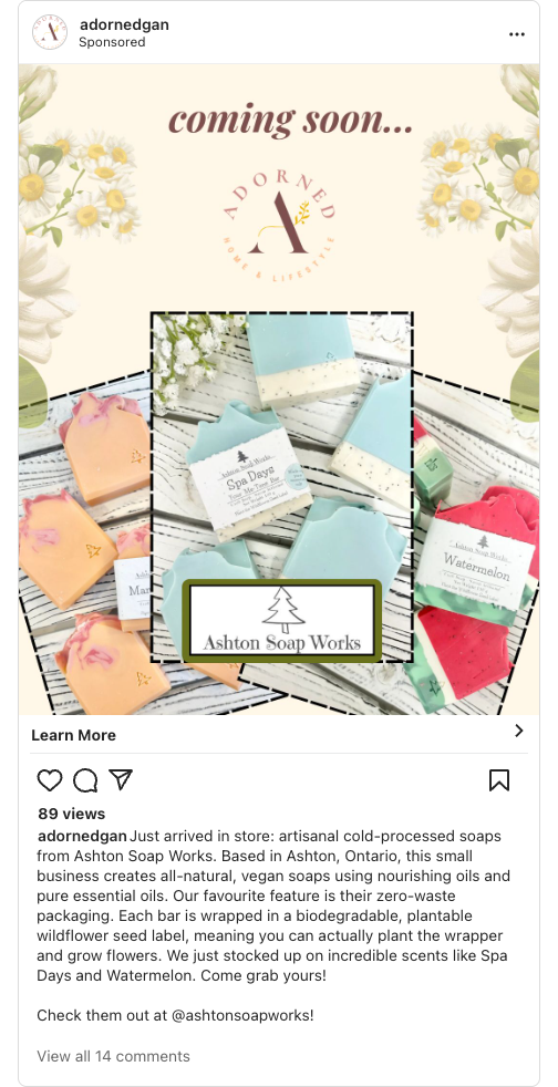
Adorned Home & Lifestyle "COMING SOON" Mockup
The Payoff
We compiled the entire marketing plan, along with the video, website, and print designs, into a formal pitch and presented it directly to the client.
For me, the biggest takeaway was learning how to balance my responsibilities as a designer with the collaborative needs of a larger agency team. It was a great experience turning a shared team strategy into a cohesive, multi channel visual campaign that gave the boutique exactly what they needed to stand out.
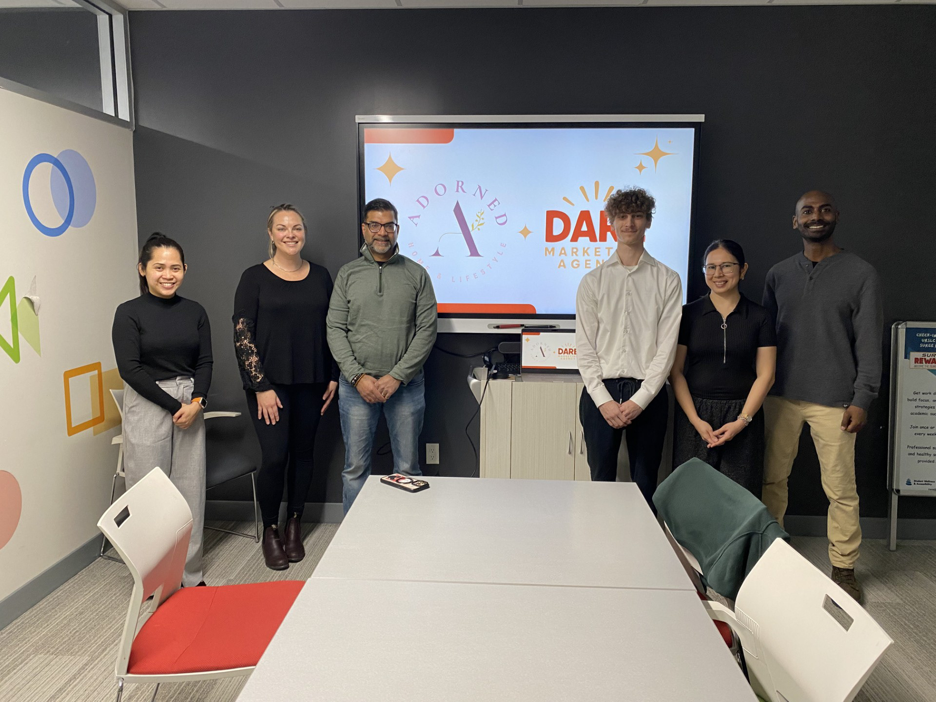
Group photo taken after our pitch presentation with the clients at Adorned Home & Lifestyle.