The Project
Island Harvest Farm is a charming, community-rooted farm gate operation located out on Amherst Island in the community of Stella. When the client reached out, they had an existing, legacy logo that served its purpose early on, but it was running into two major roadblocks: it lacked the polished visual consistency needed to stand out on a crowded shelf or farm stand, and more importantly, it didn't incorporate the mandatory information required to meet modern food labeling and regulatory standards for farm gate honey packaging.
My task was to modernize their core visual identity while keeping the rustic, local character of Amherst Island intact. The redesign had to gracefully accommodate necessary regulatory text, scale cleanly across different jar sizes, and offer flexible color variations depending on the background context of the honey and packaging.
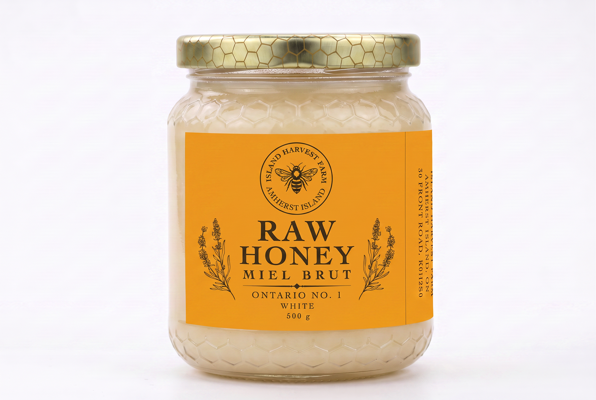
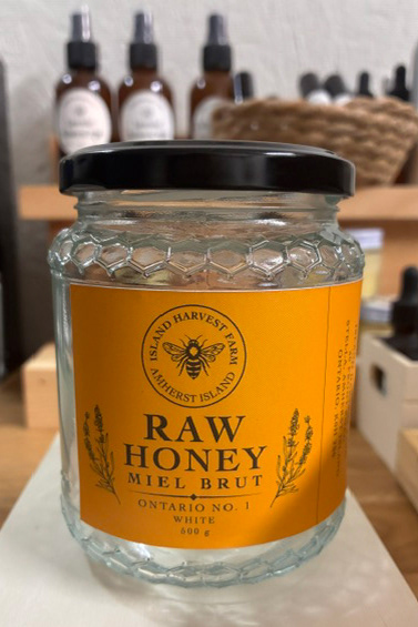
Mockup of the white honey jar and packaging.
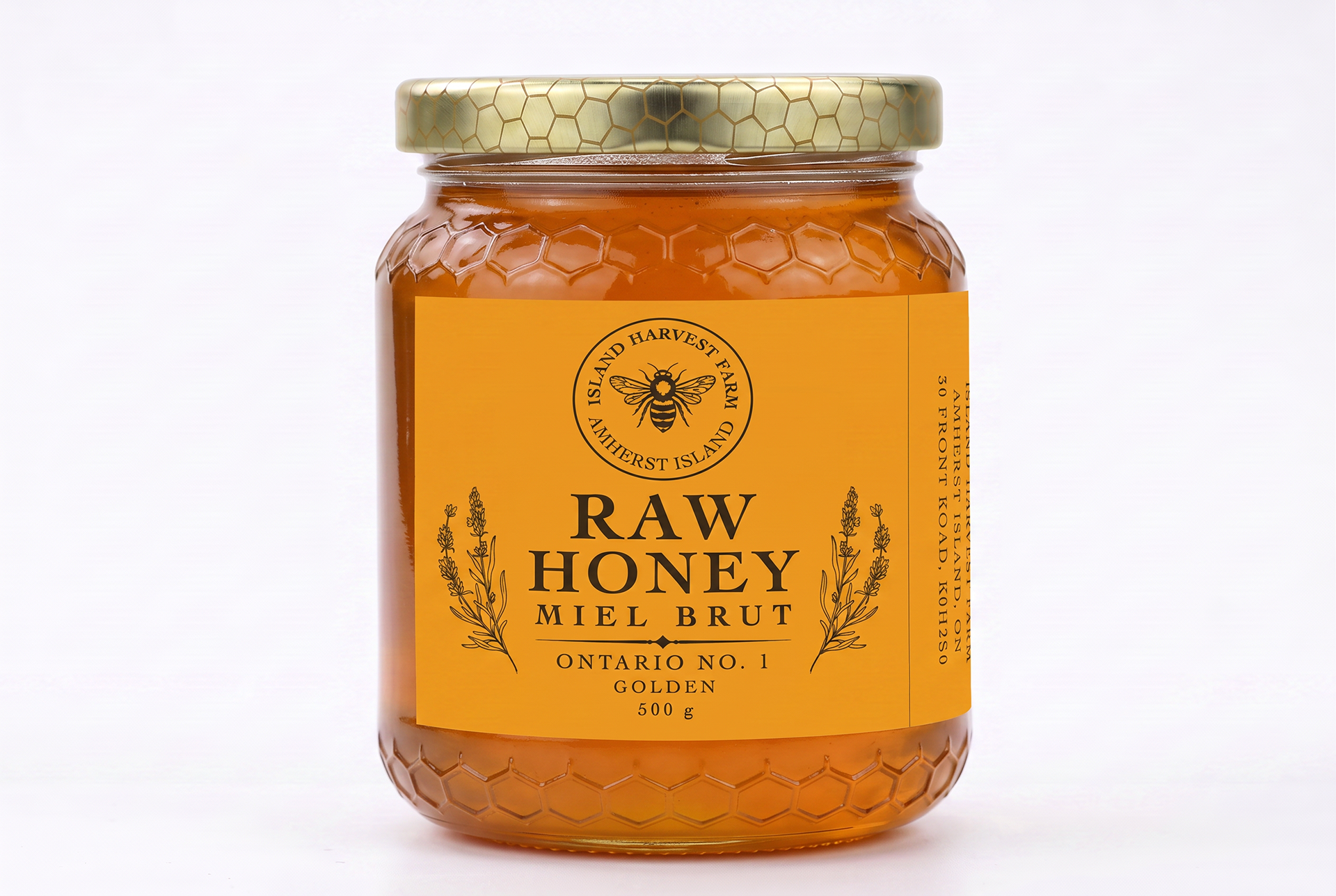
Mockup of the golden honey jar and packaging.
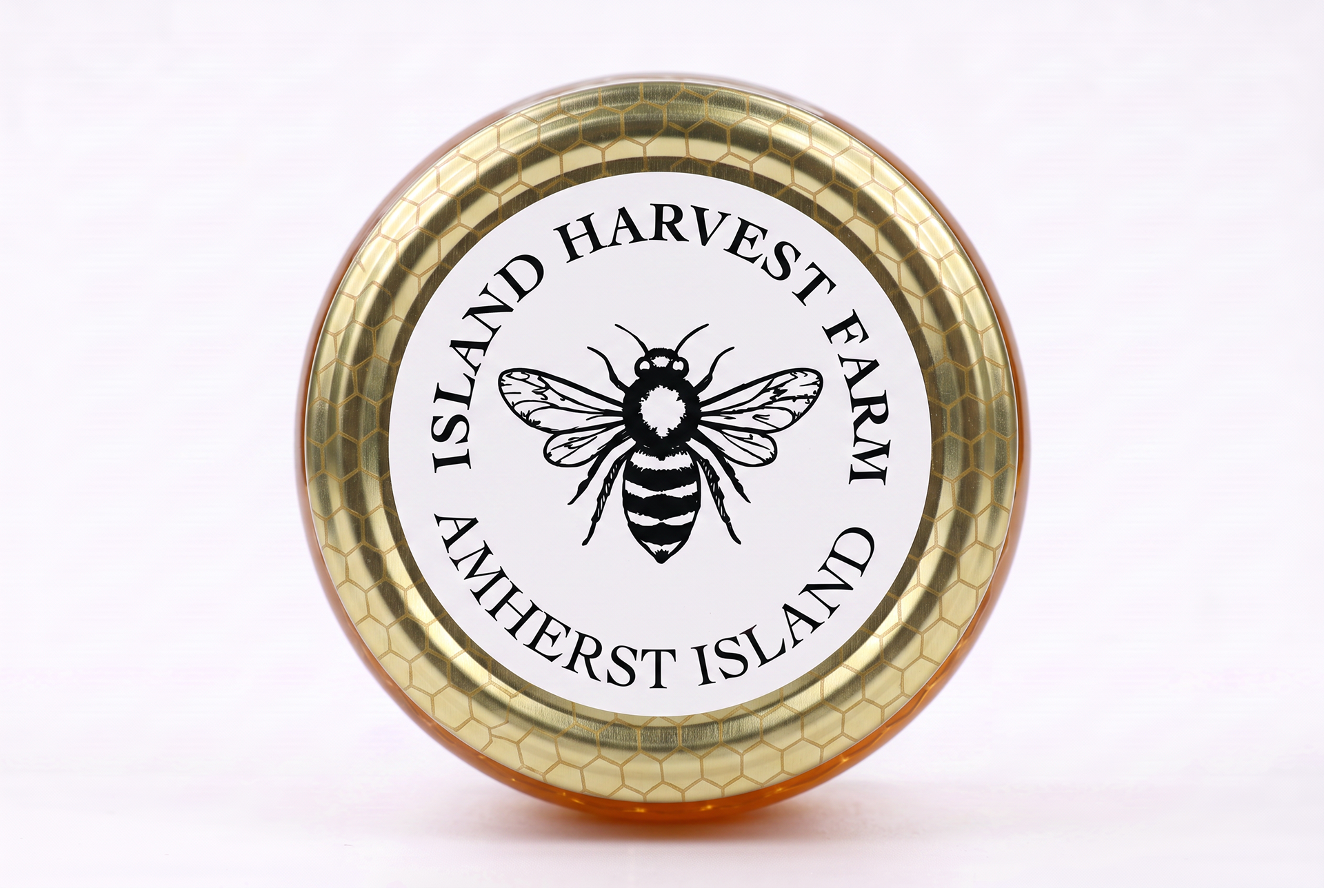
Mockup of the top-view of a honey jar with the sticker element added.
Rebrand and Compliance
The challenge was organizing a complex text hierarchy to ensure the brand name and location credentials were immediately clear, while leaving designated space for statutory weight and product descriptions required by packaging laws. To give the client maximum flexibility across different labeling stocks and jar tones, I developed two primary text and accent variations: a rich golden edition that matches the natural amber quality of raw honey, and a high-contrast white edition built to pop against darker packaging. Finally, we extracted and refined the detailed line-art bee symbol from the primary branding, converting it into a versatile circular badge and sticker asset meant for jar lids and tamper seals.
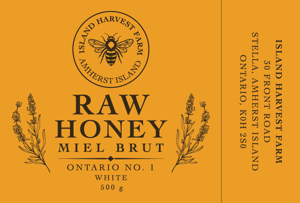
The primary "white honey" label layout, balancing mandatory regulatory text with a clean, farm-fresh aesthetic.
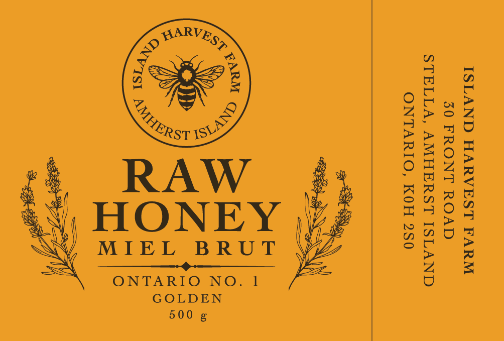
The secondary "golden honey" label layout, balancing mandatory regulatory text with a clean, farm-fresh aesthetic.
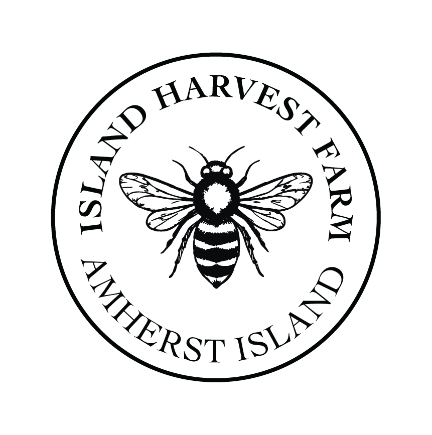
A versatile circular sticker and seal asset adapted from the brand bee symbol for jar lids and product packaging.
The Payoff
Redesigning packaging for a local producer is always deeply rewarding because you get to see digital vector work translate directly into physical goods sitting on a farm gate table.
By updating the branding, we gave Island Harvest Farm a professional, regulation-compliant look that instills instant trust with visitors exploring Amherst Island, while honoring the local roots of the farm. For me, this project was a fantastic exercise in marrying strict regulatory constraints with clean, localized graphic storytelling.