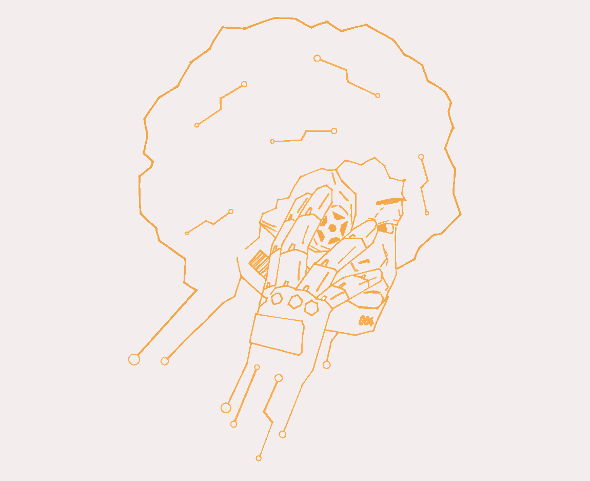
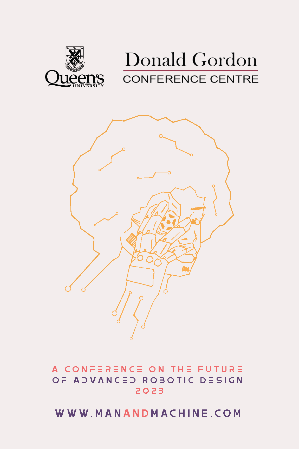
Vector illustration establishing the visual identity for the campaign, combining organic human features with mechanical integration.
The Project
This assignment challenged our class to design informational and promotional materials for a mock conference based on a topic assigned by the instructor. My assigned topic was "Man and Machine: The Future of Robotics." With that technological theme in mind, my goal was to build a cohesive design system that organized complex event information clearly while incorporating custom illustrated elements relating to robotics and machinery.
The centerpiece of the campaign poster is an illustration of a human face blended with circuitry, capturing the core theme in a striking way. I carried these circuit motifs throughout the entire project to maintain a consistent visual language from large-format posters down to interior page spreads.
The Campaign Poster
Everything started with the poster. To capture the conference title in an immediate, striking way, I wanted an illustration that felt both organic and highly technical. The centerpiece of the poster is a human figure seamlessly integrated with machinery and fine circuit patterns.
Rather than treating the poster as a random collection of graphics, I used these circuit-like motifs to anchor the entire layout. The harsh, structured lines of the machinery contrast with the human element, establishing a visual language that feels futuristic without losing its narrative core. I carried these exact graphic motifs through the rest of the campaign to ensure a unified identity.
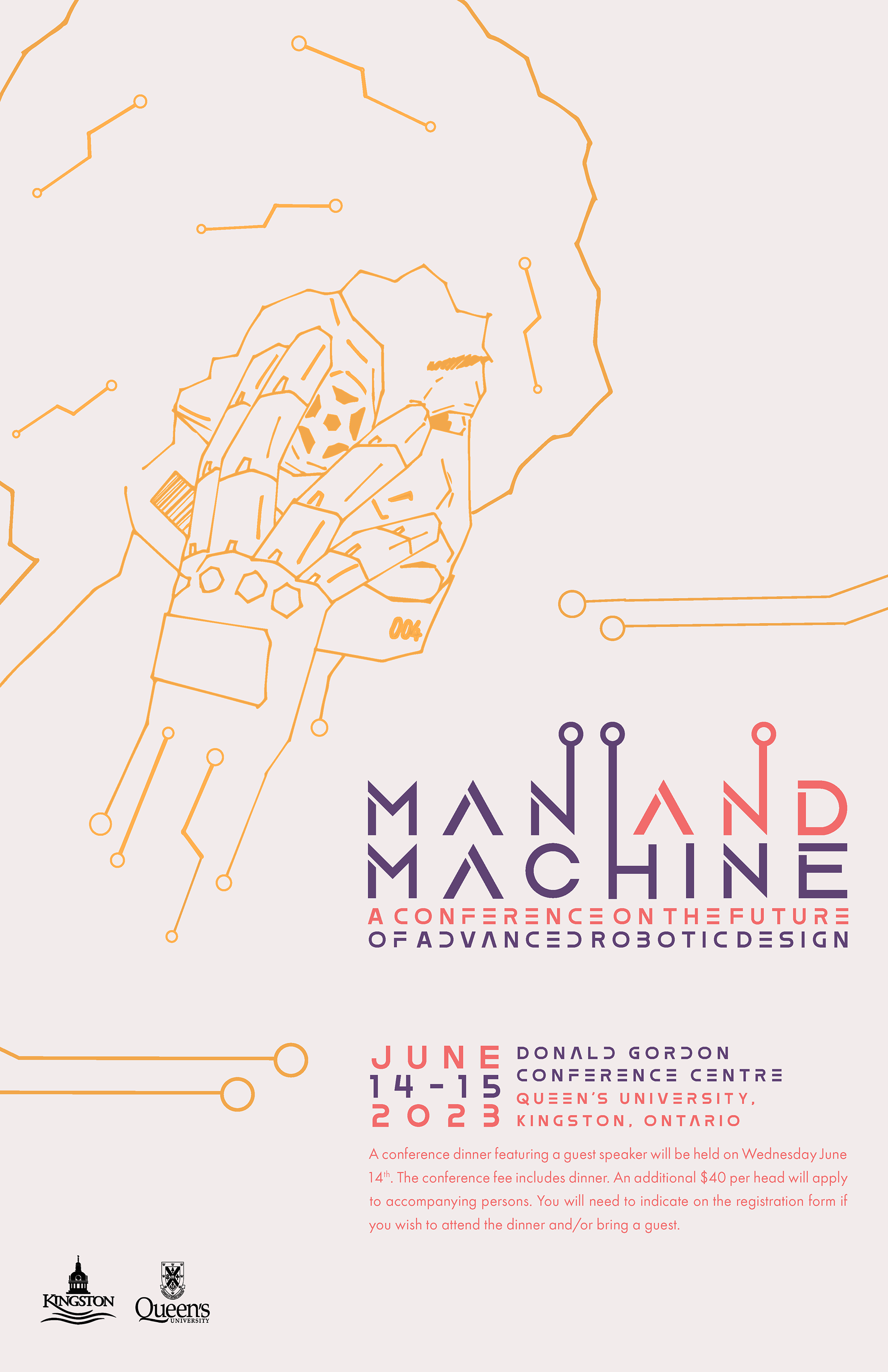

The front of the conference poster
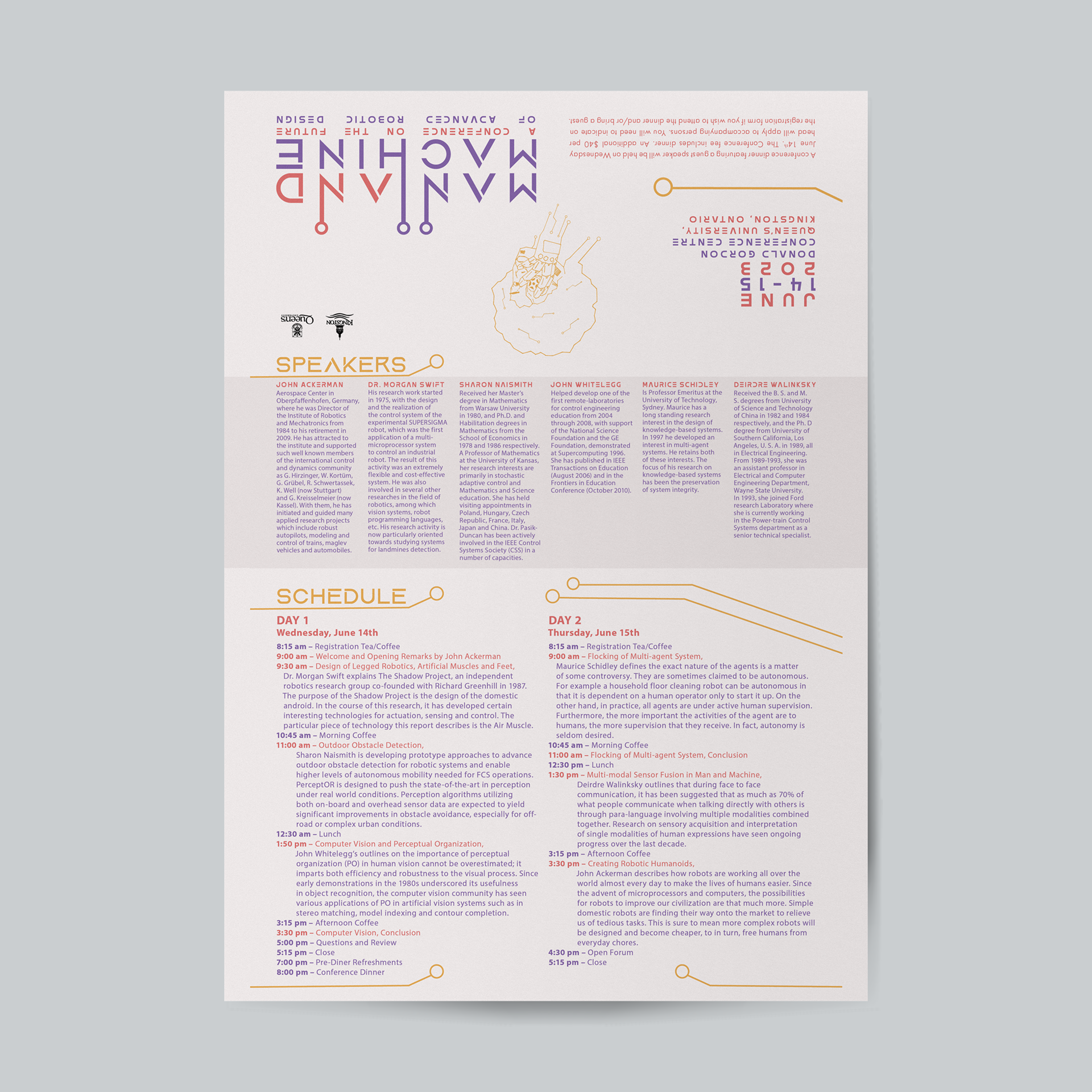
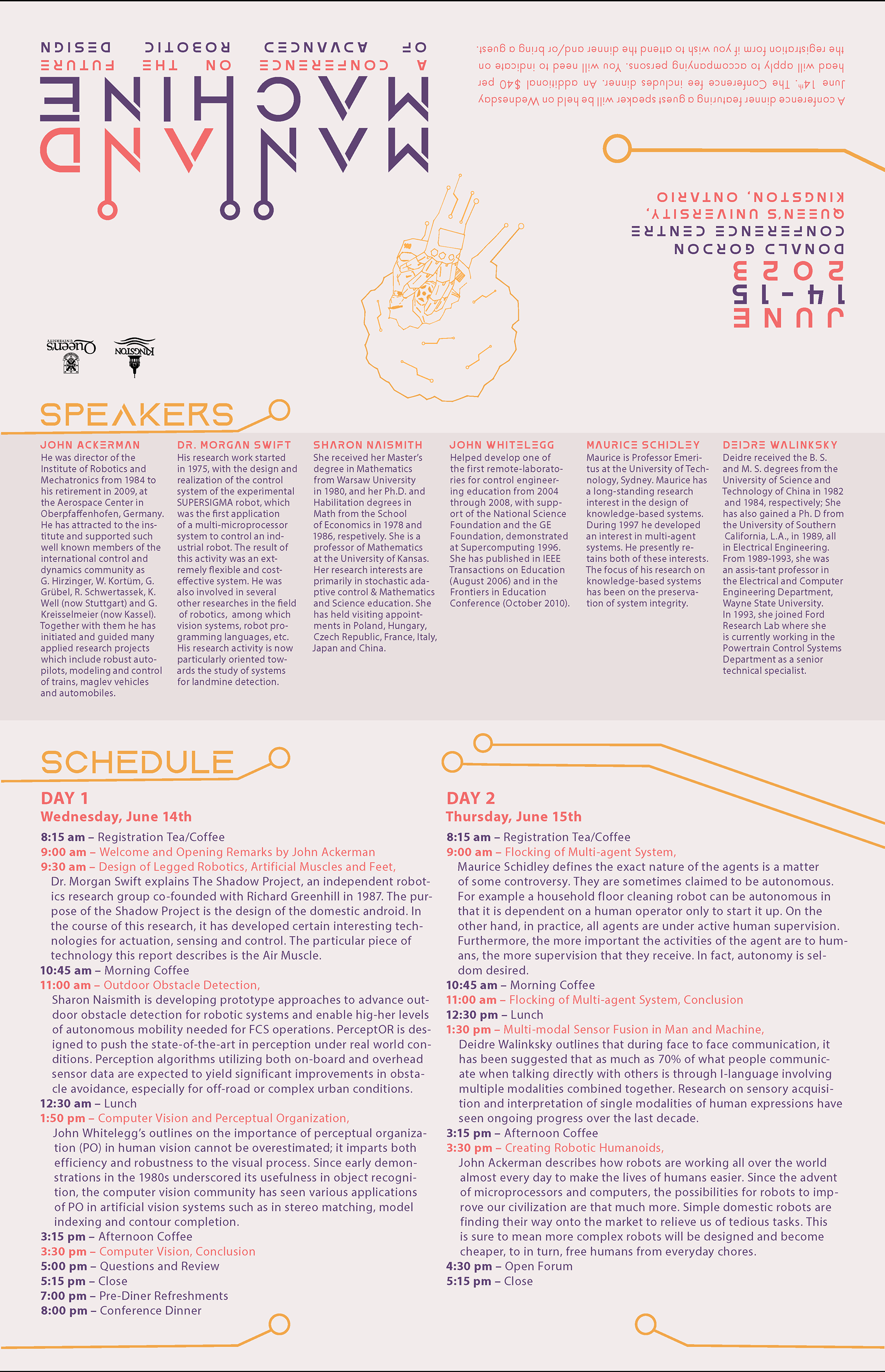
The back of the conference poster, which features details about the event
Translating to Print: The 24-Page Program Booklet
A great poster gets people in the door, but a poorly laid-out booklet makes an event miserable to navigate. Once the poster's visual identity was locked in, my next job was scaling those design elements down into a multi-page editorial format.
Designing a 24-page booklet for a tech conference means dealing with a massive amount of text, including full schedules, room numbers, panel abstracts, and speaker credentials. To keep it from looking cluttered, I built a strict column grid and established a rigid typographic hierarchy. By using clean section headers and intentional whitespace, I made sure dense schedule pages remained effortless to scan at a glance while still feeling visually connected to the front cover.
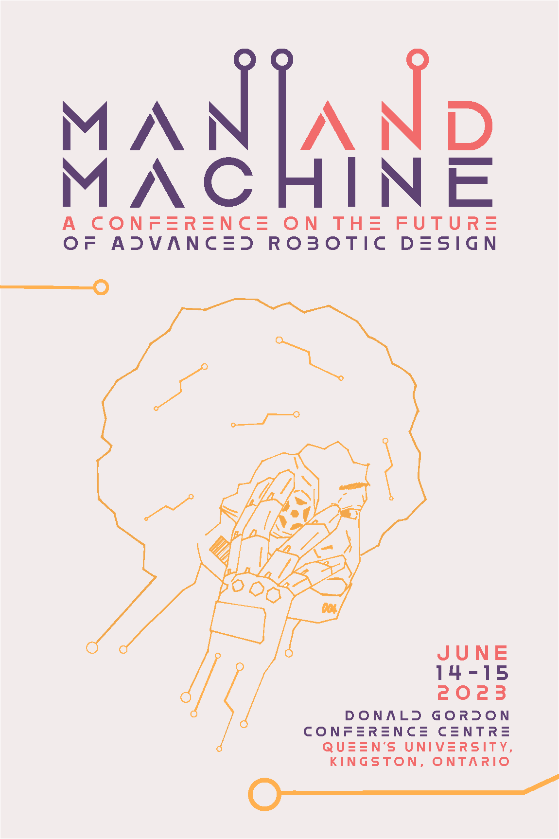
Booklet Front Cover
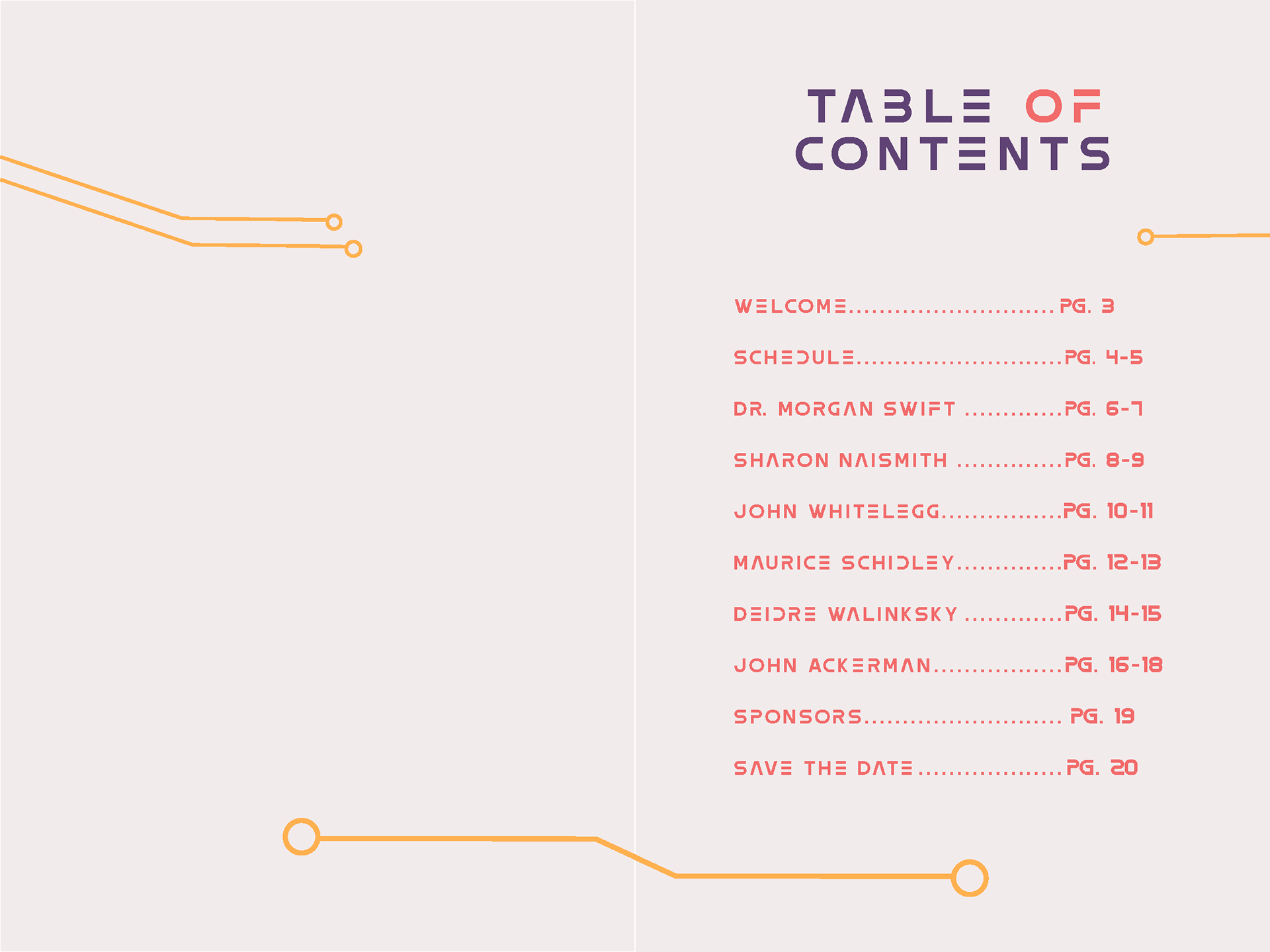
Flyleaf Page and Table of Contents

Intro and Welcome Page
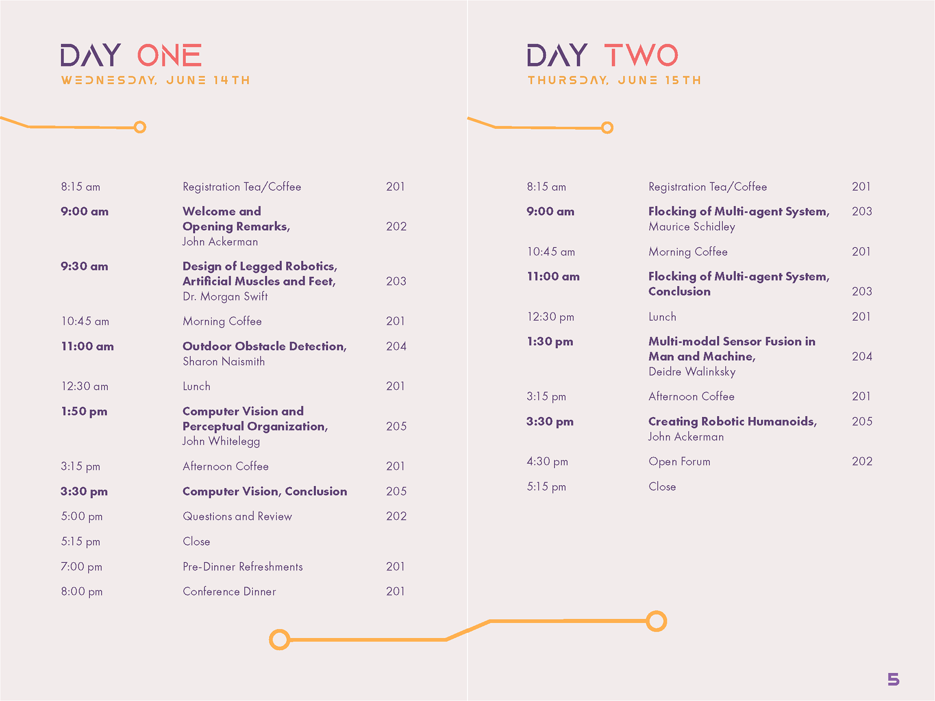
Schedule Pages

Speaker and Notes Page, Variation 1
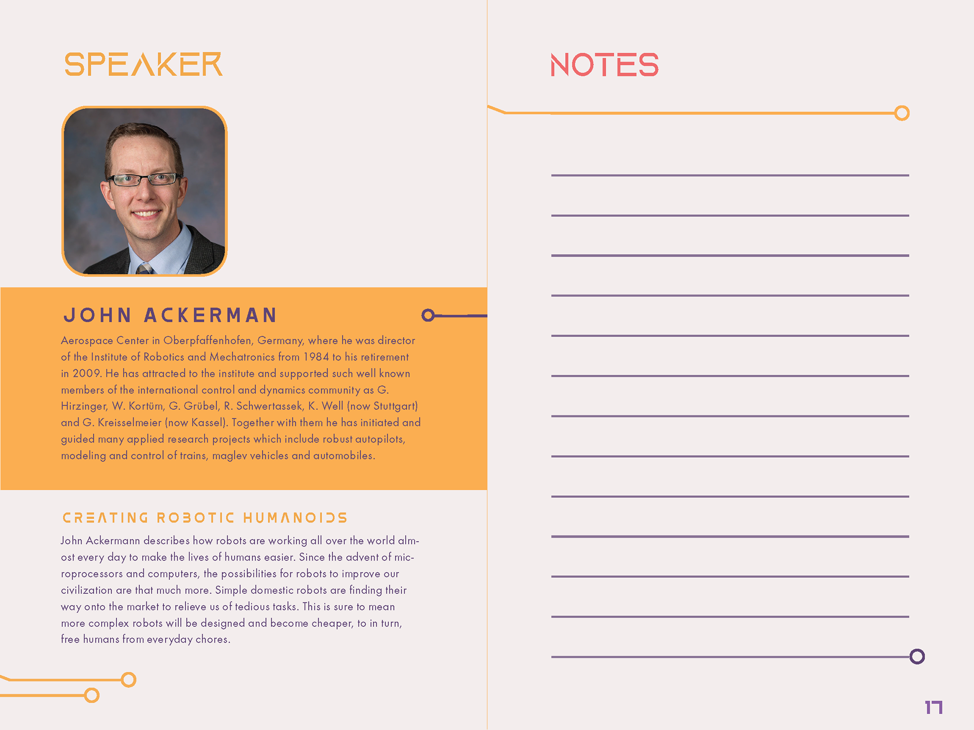
Speaker and Notes Page, Variation 2

Notes and Sponsors Page
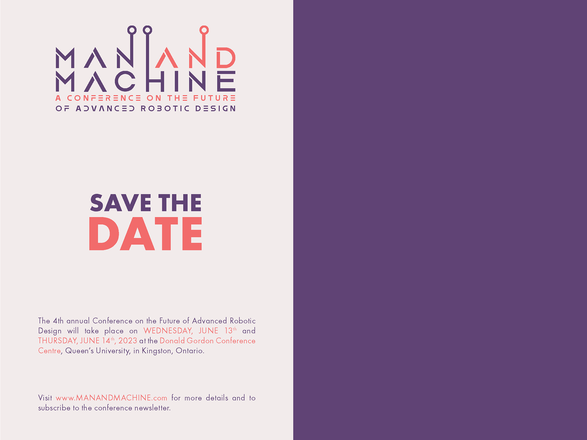
Save the Date and End-Page
Booklet Back Cover
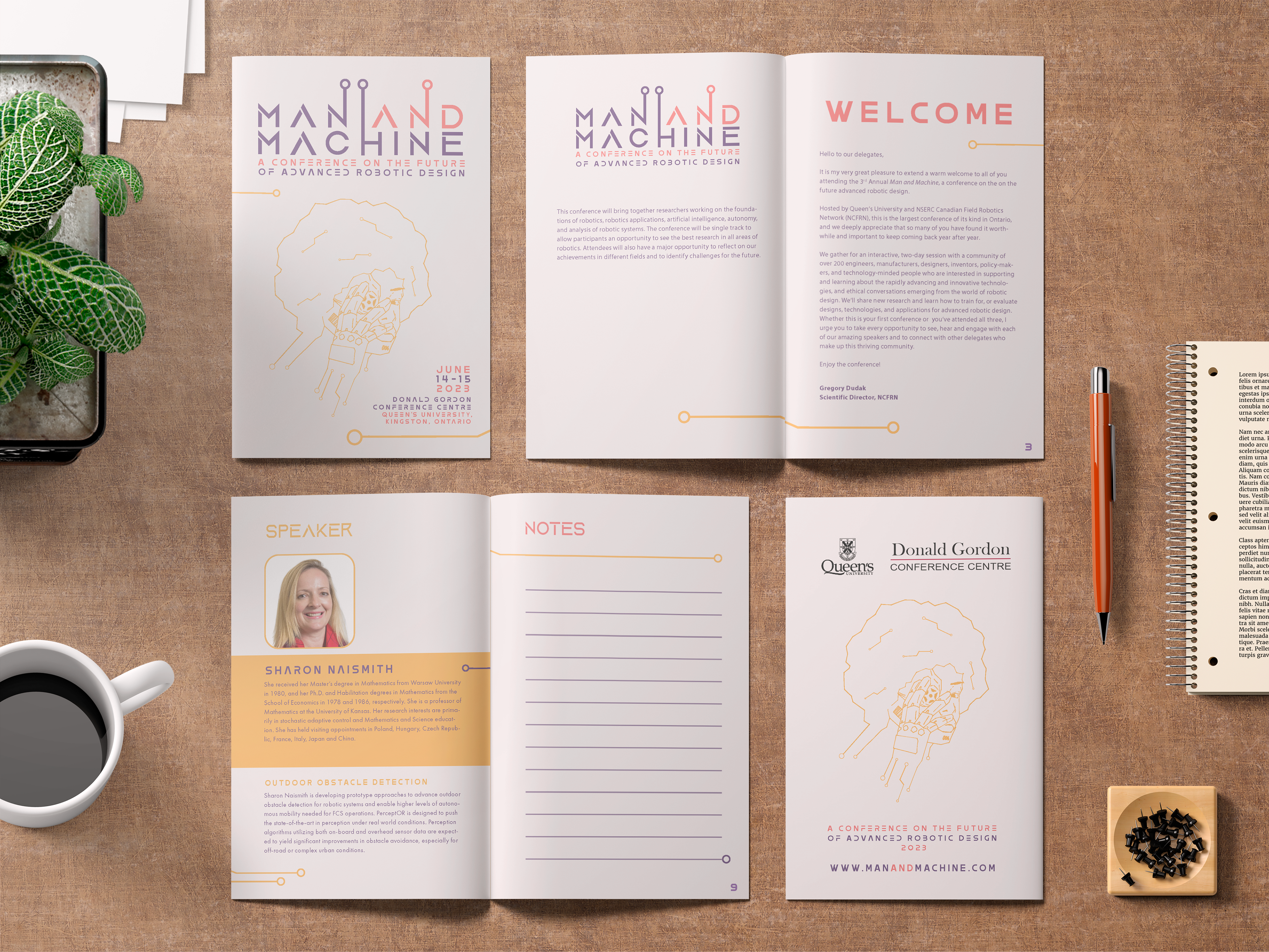
Translating the poster's visual identity onto the cover of the 24-page program booklet.
The Payoff
This project was a crucial exercise in multi-medium design. Taking a heavy, concept-driven illustration from a standalone promotional poster and successfully distributing its DNA across a 24-page editorial layout taught me how to maintain brand consistency across completely different scales of print.
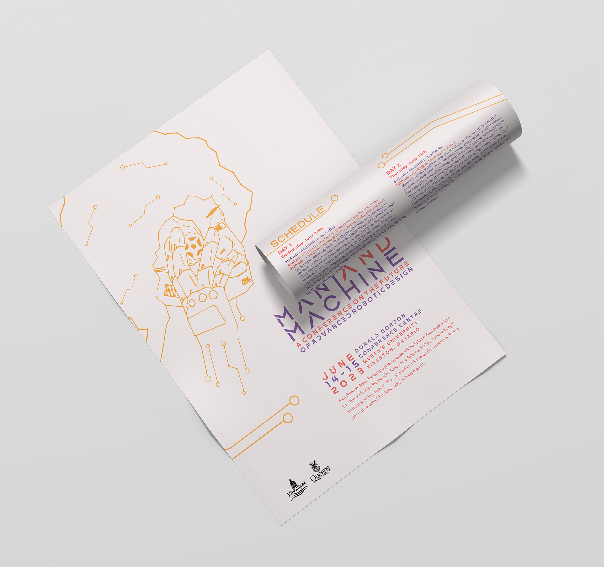
A folded mockup of the conference poster, demonstrating the material on either side